The Myth of the Perfectly Matched Country Room
A country room feels more settled when colours, textures and shapes share a quiet kinship, without every cushion, chair and curtain matching exactly.
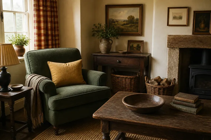
The common mistake in decorating a country room is to buy everything as a set; the cost is a space that feels staged, with little room for the eye to rest. A perfectly matched country room may look tidy in a catalogue, but a settled room often comes from quieter agreements: colours with a similar cast, textures that belong together and objects whose shapes vary without jostling.
Start with the room
Say you have inherited a small sitting room in a cottage: cream-painted walls, a dark oak table, a faded green armchair and curtains in a rusty red check. The colours are not identical, and that is not the problem. What feels awkward is that the armchair’s cool green sits beside a bright blue cushion, while a glossy black lamp and a very delicate glass vase introduce two more kinds of contrast.
Rather than replacing the chair or curtains, you might begin by noticing what the room already offers. The oak is deep and warm; the checked cloth has softened with use; the paint is creamy rather than sharp white. These details give the room a starting character. The aim is not to make every object agree, but to help the existing pieces speak in a compatible register.
In this invented situation, the occupant first removes the blue cushion and puts it aside. A cushion in muted ochre, drawn from the small warm notes in the curtains, could make a gentler link. The expected observable result is that the armchair no longer reads as an isolated patch of cool colour. Nothing needs to be an exact match for that relationship to become legible.
Read the undertones
Colour names are blunt tools. “Green” might mean a yellowish olive, a blue-leaning sage or a clear leaf green; “cream” can be buttery or almost grey. When choosing a new textile or painted object, compare it in the room’s actual light. A fabric that looks soft in a shop may turn stark against old plaster, while a brown-red that seems dull indoors may settle comfortably beside oak.
Look at colour in small groupings rather than holding each sample up alone. A scrap of linen, a paint card and a cushion cover placed near the curtains can reveal whether their undertones lean together. They need not share a hue. They may simply have a similar softness, or one may pick up a minor colour already present in another.
In the sitting-room example, a muted ochre cushion would not repeat the red check. Instead, it would connect the warm curtains to the table’s brown grain. If the cushion appeared too yellow beside the cream wall, a more earth-toned fabric could keep that link without making the room feel brighter than its existing pieces allow.
Let texture do work
Texture is often the quieter form of coordination. A nubby wool throw can sit well with smooth timber because each gives the other a clear surface to register. Linen, worn leather, glazed pottery and woven rush do not need to come from one collection; their differences can make a room feel assembled over time rather than purchased in one sweep.
In the invented room, a wool throw in a smoky, subdued tone could soften the armchair’s outline and echo the curtains’ slightly rough weave. A polished satin cushion, by contrast, might introduce a shine that has no companion elsewhere. That would not make satin wrong, but it would make its finish more conspicuous. Repeating a little of that sheen in another small object could help; leaving it out may be simpler.
Not every surface needs to be echoed. Too much deliberate repetition can become another kind of matching, especially if every rough basket is paired with a second rough basket and every glazed pot with another glazed pot. Let one or two textures carry the conversation, then allow the rest to be ordinary.
Balance the scale
Objects can share colour and texture yet still feel uneasy if their sizes compete. A broad, low table beside a slim-legged chair has a useful contrast; a cluster of several small ornaments on the table may make that contrast harder to see. Consider the outline of each piece from the doorway, not only its detail at arm’s length.
In the cottage room, the dark oak table has visual weight. The delicate glass vase may seem lost on it, while a row of little framed pictures above the armchair could make that corner fussy. The occupant might move the vase to a windowsill and leave the table with a single substantial bowl. The expected result is a clearer view of the table’s shape and less competition among small forms.
Scale does not mean matching large with large or small with small. A small lamp can be a useful counterpoint to a broad chair if its shade has enough presence to hold its place. The question is whether each object can be noticed without demanding attention from everything nearby.
What should match?
Should curtains match cushions?
They can share a colour or undertone without using the same fabric. A plain cushion in a muted colour drawn from a checked curtain often gives a room a calmer connection than repeating the check across several surfaces.
Can wood finishes differ?
Yes, if their tones have a reason to sit together. A warm oak table and a darker brown frame may feel compatible, while a very orange varnish could stand apart; compare them in the room rather than relying on the word “wood”.
How many colours feel coherent?
There is no fixed count that suits every room. Notice which colours are already large and persistent, then add new ones sparingly enough that the established pieces remain the room’s main impression.
What is not worth matching?
It is rarely worth replacing sound furniture just because its finish differs from a newer piece. A small adjustment to a cushion, lampshade or object placement may address the visual discord without turning a lived-in room into a coordinated set.
Make one change
The hypothetical sitting room does not need a full refurnishing. Its occupant could remove the blue cushion, try a muted ochre cover, move the glass vase to the sill and leave the table less crowded. Then they could sit in the room at different times of day and notice whether the chair, curtain and table feel more connected, and whether the new cushion looks too bright in afternoon light.
If the result still feels unsettled, the next question is specific: is the trouble the colour’s undertone, the surface’s shine or the object’s scale? Changing one thing at a time makes the answer easier to see. A spare fabric sample or a cushion borrowed from another room can help before anything is bought or altered.
The useful idea behind a country room that feels settled is kinship, not uniformity. Let the strongest existing pieces guide a few careful choices, and allow the grain of the table, the softness of old cloth and the oddness of a much-loved object to remain visible. A room can belong together without pretending it arrived all at once.